

One of my favorite artists is Richard Corben. His black and white style can vary depending on the medium or his mood, but always there is an underlying cinematic realism. His figures always have a light source and a shadow, giving them a 3D effect that is singularly his own.
Corben recieved his BFA from Kansas City Art Institute in 1962, when he also began working as an animator, artist, and cameraman for Calvin Productions in Kansas City. He carries his animation skills with him into his comic book stories, which play out more like little films than traditional comic stories. In the 70's Corben broke into the public eye through his underground comic work as well as stories done for Warren's black and white horror magazines.
This story is a favorite of mine that clearly illustrates his mastery of sequential and cinematic story-telling.
It first appeared in the underground SKULL COMICS #3, in 1971. My scans are from the hard-bound collection, Richard Corben's Funny Book, published in 1976. This story also appeared minus the first 3 pages under the title "The Haunted House".
This story is...rated R for nudity.
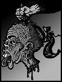
HORRIBLE HARVEY'S HOUSE!


____________________________
Here's an extra bonus , Corben fans!

"Monsters Rule" Part 4
One-page Story Original Art (1968). Corben's very first published storyline was a continuing saga called "Monsters Rule", which first saw print in Rudy Franke's Voice of Comicdom fanzine. This, the fourth installment, appeared in VOC #14, from December, 1968. While there would be considerable refinements made to his later, highly polished work, a lot of classic Corben elements were evident at this early point of his career.
( I unfortunately do not have copies of parts 1-3.)


Apocolyte: What is it about Corben that pulls me just back a step from complete fandom? I mean, all the elements are there - great drawing, visually stunning inks - dramatic flair. His style is immediately recognizable. I just don't know. Something about his lack of a sense of his own importance. It always looks to me that he is paying homage to something else, or not taking things quite seriously enough. There is always a hint of whimsy in his work, and I wish he took things the other way. I just can't put my finger on it.
ReplyDeleteGreat post! -- Mykal
Mykal,
ReplyDeleteI am glad you were able to share your true opinion, which is as valid as my own. All I can say is, to each his own. We all react differently because we have differing ideas on what we like, because of vastly different experiences.
What strikes me about Corben is that he is one of a kind, a total original. There is no other artist whose work looks like his, and to stand apart from the crowd like he does I can only respect his work even more. Yes, his characters are archetypes, his heroes look like Mr. Olympia on steroids, and his voluptuous women would fit right in any Russ Meyer's flick, but that doesn't bother me one bit. I love his visual style, whether just a pen sketch or an full color oil painting.
Thanks for your comment. See you next time!
Apocolyte: I am sooo close to being a fan. Everything you say is spot on. To carve such a unique style as an artist speaks volumes in and of itself! and his stuff is flat beautiful. -- Mykal
ReplyDeleteI've thought a lot about Corben's work over the years and why it's unique. And also why it kind of throws some people.
ReplyDeleteI think it has a lot to do with his late bloomer status as a comic book artist. Pretty much all the rest of the big names started drawing comics at a published professional level very young. Teenagers or maybe 20. Assistants to a pro usually. But here's Corben, he's got his BA back in 1962, and he's just starting to draw comics by around 1969 or 1970. So he's a fully mature adult turning his attention to comics and then working to develop his own style. He's not going to just mimick his mentor -- he doesn't have one. Nor is he going to try and copy a comic book company's house style -- he's out in Kansas and not working for Marvel or DC. So he ends up a unique talent, inventing himself as he goes.
There's a giant leap in confidence and power between early crude work like the one you've published and work from just a couple of years later when he explodes like a bat out of hell -- literally -- to become a dominant force in American comics.
But he does have an inconsistancy in his work. He can't be pinned down as easily as many because he doesn't seem to stick with a style for too long and reinvents his work to a certain extent depending on the story. I think that throws some people. When somebody reads that Wrightson or Wood or Eisner did the art on something, pretty much you can imagine what it might look like. It's a known commodity. But if you read that Corben did the art, it could range from anything to super crude roughness to lush lyrical psychadelic beauty to photorealistic eye-popper stuff. You just don't know, although it will be very identifiable as Corben. It makes him pretty unique in the history of comics and not everybody's cup of tea.
I think that Corben is the link between film making,animation,graphic design,cartooning and other styles like drafting or should I dare mention,the fine arts.Corben's influence is very apparent in today's world.You can see it in movies like "Avatar"and the 3D computor animation in the Pixar films.Video and computor games are another example of Corben's influence.Comics took a giant leap due to Corben's innovations.He had a way of making readers see a 360 degree view in his panels.Budd
ReplyDeleteTrevor,
ReplyDeleteIncredible analysis! I think you are spot on with your observations. I guess I understand his stuff may not be everyones cup of tea (maybe too strong!), but I love it so much it always throws me a bit when someone doesn't love it as much as me!
Budd,
You make a great observation as well, it's hard to think of any other comic artist with such strong ties to cinematography in their work. I'm sure he influenced more people than we can know!
If I could point to one flaw (well, not a flaw...maybe just something I don't love), or a chink in his armor, so to speak, when he began coloring stuff on the Warren mags, either the printing or his color choices were just too bold (as an artist myself I understand wanting bold colors...i tend to overdo the same way).So much of it was way too saturated, glowing pink skin, bright, clashing greens and yellows, and pinks, etc....very pretty colors, but some were a little over the top, in my opinion, which tends to muddy up the image. His later color work is superb!
To call this story "crude" is, well, a bit of a stretch.
ReplyDeleteI think when you examine some of the panels crude is pretty apt. Lots of examples here. Certainly panels like page 8 - panel 2, or like page 10 - panel 3, couldn't be described as anything but crude. Once Corben hits his stride, just a couple years later, you won't see badly drawn stuff like this in his work.
ReplyDeleteI certainly wouldn't call the storytelling crude. It's inventive, original, and delightful. Typical Corben, Mr. Corben. ;)
I'm sorry, but I just couldn't disagree more. Your two examples fall far short of what I imagine most people would consider to be "crude" artwork. Certainly the way Corben draws the human figure in this tale (especially the female figure!!) as well as his masterful handling of chiaroscuro -- and perspective in places like the last panels on pages six and eight -- pretty firmly establish this as the work of a technician who has left "crude" far behind him.
ReplyDeleteEveryone is entitled to his opinion, of course, but the use of the word "crude" seems to go beyond just opinion. For instance, when I hear the work of Jesse Marsh described as "crude" I cringe. I'm afraid I can't help but say something.
Thank you everyone for your opinions, each one is valid. I also thank everyone for keeping all differences of opinion civil and friendly. I'm sure we all have more to agree on than to disagree about.
ReplyDeleteThank you!
His work is more like CLAYMATION than animation; lumpy and organic, textured and full of gravity.
ReplyDeleteYes, Anonymous, who would call the work of Jesse Marsh crude? He blazed the trail and created the template for the masterworks of Rob Liefeld, after all. Jesse Marsh, Rob Liefeld -- those guys are artists' artists.
ReplyDeleteApocolyte: Wow! I hadn't read this story in decades. I had the original Skull comic in my underground collection in the 70s, which I ended up selling to the owner of Forbidden Planet in London, in 1983 I think. I know Corben's style is unique, but if I had to pick an influence I'd have to say that I see Jack Davis in there somewhere. Especially on the page where the girl is waving her boobs around, particularly where she does that leap in the air. Also the last page with the girl and Harvey running towards each other - Davis type humor and artistic style to me, but only an influence. Great to read this again - thanks!
ReplyDeleteThe panel that you selected to "highlight", before moving on into this story is fabulous.
ReplyDeleteIt really does grab you, doesn't it?
I would love to see Corben at a convention, but that hasn't happened yet. I'll have to keep my fingers crossed.
Hey, "Trevor M", do me a favor and explain what you mean by "crude". Please?
ReplyDeleteHey everybody, it seems we have a bit of controversy going here...all I can say is, at times Corben's art has a kind of 'cartoony' feel to it, but I would certainly stop short of saying the art is crude. It is unique and I am a huge fan. I personally would be thrilled if I could do work as 'crude'!
ReplyDeleteOpinions are by their nature highly personal, and we will never all agree on every point, yet we can still enjoy a mutual respect in some area of common ground, I hope! I thank you all for your comments.
Trevor, you seem to have stepped on a few toes inadvertantly. As for me, if talking about Corben and Liefeld, I would be more apt to hang the word 'crude' on the latter more than the former, but that is my opinion.
KB, Though his style is so utterly his own, I can see the possibility of Davis' influence on Corben. both completely unique and instantly recognizable artists.
Chuck,
How about it, brother?! You are preaching to the choir now!
Kevin,
Wonderful to hear from one of today's greatest masters of black and white graphic arts!(as well as color!) Please be aware that an upcoming post is going to be dedicated to you and your art, as we touched on briefly a while back. Ther won't be anything crude about THAT post! Thank you.
I was surprised by the "crude" comment directed at Corben but the snarky Jesse Marsh dig really baffled me. I would just point out that the two artists are very highly regarded by other comic artists, even more than they are by collectors and casual fans. Maybe it's because there are qualities in their work that look easy until you pull out a pen and a blank sheet of paper and try to do it yourself.
ReplyDeleteAlex Toth wrote a nice appreciation of Marsh in an issue of PANELS magazine years ago and I know the Hernandez brothers are big fans. I've never heard anything but awe and admiration for Corben's work when I've talked with other artists.
Here's a quote from Toth's piece: "I hope that, upon digesting this rambling testimonial to the rather quiet and quite different qualitative artistic fare offered by Jesse Marsh in all his endeavors, you will take the trouble to avail yourself of the comics mentioned –- and READ his stories, enjoy his art! You'll find more there than you might have expected, from a first superficial skimming."
Thanks in advance for the upcoming post. I haven't done as many B&W stories as I'd like but I've really enjoyed your blog and we seem to like a lot of the same material from the old books.
Kevin,
ReplyDeleteThank you for the information and Toth quote regarding Jesse Marsh. Here I have to say that, even though as an artist myself I have been a fan and follower of comics and comic art for all of my life, astonishingly I had never heard the name or come across the work of Jesse Marsh before this! Doing online searches has revealed samples of his work to me, and so now I must add yet another fine artist to my growing list of favorites! Proves you're never to old to learn something new! It is interesting that Toth speaks so highly of Marsh, in that I can see elements in Marsh's work that is very reminiscent of Toth's style!
If I may shift gears here and say, I believe there may be a slight misunderstanding in all this 'crude' debate, especially in regard to Marsh. In re-reading the commentary above, I do not see anyone denegrating Marsh. Trevor and Anonymous had an exchange where Anonymous, referencing Trevor's 'crude' remark, brought up Marsh first by saying, in effect, " I have to respond to your crude remark...for example, I would have to say something IF someone called Marsh's work crude." Then Trevor responds saying, "Who thinks Marsh is crude? He is an artist's artist." As far as I see, it seems everyone who referenced Marsh thinks highly of him.
Now, if I may be so bold as to presume to speak for someone else, I offer my interpretation of Trevor's remark about this Corben story being crude. While I don't agree about the terminology, I believe he meant that in comparison to some of Corben's later work, this story lacks some of the photo-realism that would appear in much of his art as he progressed. I think it is safe to say Trevor is a fan of Corben from his comments. My only disagreement with him is when he said that this story was "badly drawn"...I believe that was a poor choice of words. Yes, some of Corben's later art is just breath-taking in it's beauty and realism, and in comparison, this early story may be considered by some to be inferior, but I am not one who finds it so. I hold this story, as well as every Corben work, in the highest regard. Comic art does not have to be photo-realistic to be excellent, and this story is excellent, in my opinion. Nothing can change my mind on that.
Now Kevin, when I called you one of today's masters of black and white art, even though your comics are primarily published in color, what I meant was that your pre-colored inked artwork has an amazing power to it that I daresay most of your contemporaries lacks. I'm not trying to stroke you here, just saying I am a huge fan of yours. Some of your art in B & W has a wonderful quality that comes across like a high contrast black and white photograph! In my opinion, your grasp of chiaroscuro, your black and white contrasts puts you in the ranks of the very few, along side Wally Wood, Steranko, and one or two others. Unlike some (most) comic art, yours doesn't necessarily require color to be enjoyed, in fact, even though you are an excellent colorist as well, I prefer the stark power of your B & W images! I'll stop gushing now, and save the rest for when I post your work!
All the best!
Actually Trevor lumped Rob Liefeld and Jesse Marsh together when he called them "artists' artists." He was obviously being sarcastic, making Mr. Nowlan's comments totally on point, and certainly coloring all of Trever M.'s other assessments of comic artists.
ReplyDeleteTamfos,
ReplyDeleteHmmm...I guess I don't see it quite that way. I didn't sense sarcasm at all. I think he was being sincere. Even though Rob Liefeld is not one of my favorite artists, it may be that Trevor regards Liefeld higher than you or I might. In any case, I do appreciate your comment.
Perhaps Trevor can clear up any more controversy by clarifying his comment.
Liefeld does have his supporters as well as his detractors. Vince Colletta is villified by many, yet there are many like myself, who can appreciate his contributions to comic art. We all like what we like, and no two people are going to agree on every topic, especially art appreciation.
Ah, diversity! Helps make the world interesting!
Thanks!
Apocolyte, you are too trusting and/or gullible. That Marsh-Liefeld comment was dripping with sarcasm.
ReplyDelete