

When Warren Publishing wanted to put out a black and white horror mag companion for their successful CREEPY, they chose the name EERIE. Unfortunately, so had another publisher, and in order to beat the competition and gain the legal rights to the name, Warren slapped together a few CREEPY stories, cobbled a cover featuring the new logo, and got their version of EERIE # 1 to the stands first. The rest, as they say, is history. So EERIE # 2, in 1966 was in truth the real first issue, but that didn't matter much because those first few issues were essentially just like CREEPY -- great art, great stories.
This one is from the renowned and capable Alex Toth. In the story by Archie Goodwin, obsessive art collector's think they have found the perfect artist...or have they? Heh heh...
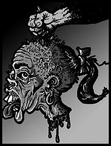
Here is...VISION OF EVIL!


_____________________________________


Read an article from Alter Ego or comic book artist a few years back~ in which~ Toth professed that he really loved the freedom of working for Warren mags, as it offered him the chance to use grey tones and get artsy. The washes in this piece are evidence of that joy~!
ReplyDeleteThe other publisher was the infamous Myron Fass, who had previously given us Lunatickle, one of the first imitations of the black-and-white Mad Magazine; the wretched Split!-ing Captain Marvel; and later porno FLICK (whose title at first glance might seem to be a different word). His Eerie was to cash-in on the market revealed and developed by Creepy. When thwarted in using the name for the magazine itself, he none-the-less called the corporation “Eerie Publications”. It published various titles, the stories in which were alternately reprints of pre-code horror, altered to add gore, and pre-code horror tales redrawn (often by Dick Ayers).
ReplyDeleteLysdexicuss - I can certainly believe that about Toth. I agree that this gray tone wash effect is not a typical effect, even for him...kind of grainy. I imagine many other artists enjoyed the freedom of Warren's format.
ReplyDeleteoeconomist - Thank you for that eloquent and informative comment. You have so wonderfully filled in all the holes I had left in my fairly vague post intro. While I can appreciate Fass' contribution to comics in general, and I have a soft spot for Lunatickle, a demented, bi-sected Captain Marvel demands he go back to square one and earn my respect again. Actually, there is(was) plenty of room on the news-stands for both publisher's products, and if my wallet was fat I'd probably have bought both. If fate had deemed Fass the rights to the name of Eerie, Warren's EERIE would have just have come out with a different banner, and would be a case of a rose by any other name...
Thanks for dropping comments, gentlemen!
Kudos Apocolyte! I love Toth (and Goodwin is probably my top 1 or 2 writers for Warren). There is such a sense of urgency and flow to Toth's art here. And even though the story has kind of an H.P. Lovecraft homage-feel to it (Pickman's Model) that's a good thing.
ReplyDeletebest,
r/e
Apocolyte: Great stuff. I loved the Warren mags for those great grays, as others have noted. It's interesting to see Toth in this setting. He seems to be really enjying himself. Great post! -- Mykal
ReplyDeleter/e and Mykal,always a pleasure to hear from you. Thank you, fellow bloglodytes!
ReplyDelete